


Table of Contents
- Understanding Color Theory for Clothing
- How to Use a Color Wheel for Outfits
- Best Color Combinations for Shirts
- Color Analysis for Clothing and Skin Tone
- Step-by-Step: How to Match Shirt Colors Online
- Lighting and Fabric Texture Impact on Color Matching
- Building a Coordinated Wardrobe with Color Harmony
- Conclusion
Last Updated: August 27, 2026
Understanding Color Theory for Clothing
Color theory is the science of how colors interact with each other and affect human perception. When applied to clothing, it becomes the foundation for building outfits that look intentional, cohesive, and flattering. The color wheel organizes hues in a circular pattern, showing relationships between primary, secondary, and tertiary colors. Understanding these relationships helps you make informed decisions about which garments work together.
The reason color theory matters for your wardrobe is simple: certain color combinations create visual harmony while others create tension. Warm colors (reds, oranges, yellows) feel energetic and approachable (peer-reviewed research). Cool colors (blues, purples, greens) feel calm and professional (apa.org). Neutral colors (blacks, whites, grays, beiges) serve as anchors that let other colors shine. When you grasp these fundamentals, you stop guessing about what works and start building with intention.
At Scott's T's & More, we understand that expressing your personality through color-coordinated apparel matters. Whether you're selecting a humorous tee that matches your existing wardrobe or building outfits around statement pieces, knowing how colors interact elevates your entire look. The good news is that color theory isn't complicated once you learn the basic patterns.
How to Use a Color Wheel for Outfits
A color wheel is your visual guide to understanding which colors naturally complement each other. The wheel displays 12 primary hues arranged in a circle, with variations showing tints (lighter versions) and shades (darker versions) of each color (nga.gov). To use it for outfit coordination, you identify which colors sit next to each other, opposite each other, or in triangular relationships on the wheel.
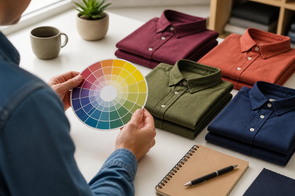
The most practical application involves three main color harmony patterns. First, complementary colors sit directly opposite each other on the wheel, think blue and orange, or red and green. These combinations create maximum contrast and visual interest. Second, analogous colors sit next to each other, like blue, blue-green, and green. These create harmonious, peaceful combinations. Third, triadic colors form an equilateral triangle on the wheel, offering balanced variety without clashing.
To apply this to your clothing, start by identifying your dominant color. Is your base shirt navy blue? Find navy on the color wheel. Then look at what sits opposite (orange tones), next to it (other blues and teals), or in a triangle pattern (orange and a yellow-based green). These relationships guide which secondary pieces, jackets, accessories, or layering items, will enhance rather than fight with your primary color.
Complementary Color Combinations
Complementary colors create bold, confident pairings. Navy and orange, burgundy and teal, or mustard yellow and deep purple all represent complementary relationships. These combinations work exceptionally well for statement outfits where you want colors to pop and draw attention. A navy tee paired with burnt orange accessories creates immediate visual interest.
The key to wearing complementary colors successfully is balance. If both colors are equally intense, the outfit can feel chaotic. Instead, let one color dominate and use the other as an accent. Wear a navy shirt as your base and add a small orange scarf, belt, or shoes. This approach uses color theory without overwhelming your appearance. Complementary combinations are particularly effective in professional settings where you want to appear confident and decisive, or in casual contexts where you're comfortable drawing attention.
Analogous Color Harmonies
Analogous colors sit side by side on the color wheel and create naturally pleasing combinations. Think teal, blue, and blue-green, or yellow, yellow-green, and green. These pairings feel cohesive and restful because they share similar undertones. A forest green shirt layered under a teal jacket demonstrates how analogous colors work together without requiring effort.
Analogous combinations are ideal when you want a polished, intentional look without high contrast. They work beautifully in monochromatic outfits, wearing various shades of the same color family. A light blue shirt, medium blue sweater, and dark teal jacket create depth and sophistication. These harmonies are especially useful for building capsule wardrobes because pieces naturally coordinate. The downside is that analogous combinations can sometimes feel safe or understated, so they pair well with texture or pattern to add visual interest.
Best Color Combinations for Shirts
Certain shirt color combinations work universally well because they respect both color theory and practical wearability. Neutral base colors, white, black, gray, navy, and beige, pair with virtually everything. A white shirt coordinates with every other color in your closet. Navy works with earth tones, pastels, and other cool colors. Black creates contrast with lighter colors and adds sophistication to warm tones.
Beyond neutrals, some combinations have proven staying power. Burgundy and navy create a rich, professional pairing. Olive green and cream feel natural and approachable. Soft pink and gray offer a contemporary, balanced look. Mustard yellow and charcoal gray combine warmth with sophistication. The reason these combinations work is that they respect color temperature, pairing warm colors with warm undertones and cool colors with cool undertones.
When selecting shirt colors for your wardrobe, consider your skin tone, the lighting where you'll wear the outfit, and your personal style. A color that looks stunning in natural daylight might appear dull under fluorescent office lighting. Similarly, a vibrant color that flatters one person's complexion might wash out another. This is where color analysis becomes valuable.
Color Analysis for Clothing and Skin Tone
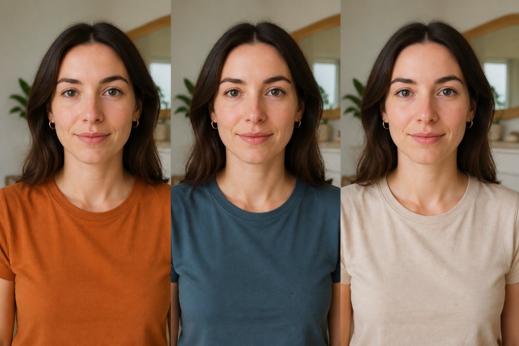
Color analysis examines how your natural coloring, skin tone, hair color, and eye color, interacts with clothing colors. The process traditionally involved professionals using color swatches to determine whether you have a warm, cool, or neutral undertone. Once you know your undertone, you can select shirt colors that enhance your natural features rather than compete with them.
Warm undertones pair beautifully with warm colors like gold, warm reds, oranges, warm yellows, and warm greens. If you have warm undertones, a mustard yellow or warm burgundy shirt will make your skin appear more radiant. Cool undertones benefit from cool colors like silver, cool reds, purples, cool blues, and cool greens. A person with cool undertones looks more vibrant in a jewel-tone emerald or cool-toned burgundy. Neutral undertones have flexibility and can wear both warm and cool colors effectively, though certain shades will still flatter more than others.
The intensity of the color matters equally. If you have fair skin with high contrast (light skin, dark hair), you can wear intense, saturated colors. If you have lower contrast coloring, softer, muted versions of colors often work better. A person with medium olive skin might look stunning in a muted sage green but washed out in a bright lime green. Understanding these nuances helps you match shirt colors online with confidence.
Step-by-Step: How to Match Shirt Colors Online
Matching shirt colors online requires a systematic approach. Start by taking inventory of your current wardrobe and identifying your base colors, the neutrals and core colors you wear most frequently. Photograph these items in natural daylight so you have accurate color references. Many people are surprised at how differently colors appear under different lighting, so this step matters.
Next, use online color matching tools to explore combinations. Several approaches work well. First, you can use a digital color wheel tool, many are free and available online. Upload a photo of your existing shirt or enter a color code, and the tool suggests complementary, analogous, and triadic combinations. Second, you can use AI-powered clothing recoloring tools that let you visualize how a shirt would look in different colors before purchasing.
Using AI-Powered Recoloring Tools
AI-powered recoloring tools use image processing technology to change clothing colors in photographs. You upload a photo of a shirt you like, select a new color, and the tool generates a preview of how that shirt would appear in the new color. This technology has become remarkably accurate, accounting for fabric texture, lighting, and shading. The benefit is that you see realistic previews rather than imagining how colors will look.
To use these tools effectively, start with high-quality product photos. Manufacturer photos work better than casual snapshots because they show true color and detail. Select the recoloring tool, upload the image, and experiment with different color options. Many tools let you adjust color intensity and saturation, so you can see how subtle or bold variations appear. Take screenshots of combinations you like, then compare them against your existing wardrobe. This visual approach removes guesswork from online shopping.
Virtual Draping and Color Detection
Virtual draping simulates holding colored fabric against your body to see how colors work with your complexion. Some advanced tools use your smartphone camera to analyze your skin tone, then recommend compatible colors. These tools employ color detection algorithms that measure your skin's undertone and suggest a personalized palette.
To use virtual draping tools, you typically upload a selfie or use your device's camera. The tool analyzes your coloring and generates recommendations. You then use these recommendations when shopping for shirts online. The advantage is personalization, the tool learns your specific undertones rather than applying generic warm/cool/neutral categories. Many fashion retailers now offer virtual try-on features that show how specific items would look on your body type and coloring, making online color matching significantly more reliable than it was even a few years ago.
Lighting and Fabric Texture Impact on Color Matching
The same shirt color appears dramatically different under various lighting conditions. Natural daylight shows true color. Warm incandescent lighting makes colors appear more yellow and orange. Cool fluorescent lighting shifts colors toward blue and green. LED lighting varies depending on the bulb's color temperature. When you match shirt colors online, account for where you'll actually wear the outfit.
If you're selecting colors for professional settings where you'll spend time under fluorescent office lighting, test how colors appear in that environment. Bring sample colors to your office or photograph them under similar lighting. A color that looks perfect in your home's warm lighting might appear sickly under office fluorescents. Conversely, colors that seem dull at home might pop under certain workplace lighting.
Fabric texture also affects color perception. A matte fabric absorbs light and makes colors appear darker and more muted. A glossy or shiny fabric reflects light and makes colors appear brighter and more saturated. A textured fabric like corduroy or cotton creates visual depth that changes how you perceive the color. When shopping online, read product descriptions that mention fabric content and finish. A silk shirt in burgundy will look different from a cotton t-shirt in the same burgundy due to how each fabric reflects light.
Building a Coordinated Wardrobe with Color Harmony
Creating a wardrobe where pieces naturally coordinate requires strategic color selection. Start with a foundation of neutral colors, typically 2-3 neutrals that you love. These might be black, navy, and white, or gray, beige, and cream. These neutrals serve as anchors that work with everything else. Then add 3-4 accent colors that work with your undertone and create harmony together.
When selecting accent colors, apply color theory principles. Choose colors that are either analogous (next to each other on the color wheel) or complementary (opposite each other). Avoid random color selections that don't relate to each other. If your accent colors are forest green, burgundy, and mustard yellow, these work together because they share similar undertones and create visual interest without clashing.
Scott's T's & More offers humorous graphic tees in various colors, making it easy to build coordinated outfits around statement pieces. When selecting colored tees from any retailer, consider how they fit into your existing palette. A witty design in a complementary color to your other pieces adds personality while maintaining cohesion. The key is intentional selection rather than random accumulation.
As you build your wardrobe, use online tools to preview combinations before purchasing. Take photos of pieces you own, use color matching tools to identify what works, and verify combinations using virtual draping or recoloring technology. This approach reduces returns and ensures that new purchases integrate seamlessly with existing items. Over time, you'll develop an intuitive sense for which colors work together, making future selections faster and more confident.
Building a wardrobe where every piece works together starts with understanding how colors interact. Color theory gives you the framework, online tools give you the technology, and intentional selection gives you results. When you know how to match shirt colors online, you stop settling for outfits that feel random and start creating looks that feel intentionally coordinated. Whether you're shopping at Scott's T's & More for a humorous statement piece or building around basics, applying these color principles ensures that your selections enhance rather than complicate your wardrobe. Start with your undertone, use online color tools to explore combinations, and let color harmony guide your purchases. The confidence that comes from knowing your colors work together is worth the effort.
Frequently Asked Questions
How do I match shirt colors online without seeing them in person?
Use AI-powered recoloring tools that let you upload photos and visualize color changes in real time. Start by understanding your skin tone and which colors complement it through color analysis. Most online tools use color detection to show how different shades will look on you, accounting for lighting and fabric texture. Test multiple color combinations before purchasing to ensure the final result matches your expectations.
What's the best way to use a color wheel to match my outfits?
A color wheel helps you identify harmonious color combinations. Complementary colors sit opposite each other on the wheel and create contrast, while analogous colors sit next to each other for a cohesive look. For shirts, pull a color you own, find it on the wheel, then choose complementary shades for pants or layering pieces. This method ensures your outfit coordination feels intentional and balanced rather than random.
Which color combinations work best for shirts in professional settings?
Best color combinations for shirts in professional environments include neutral bases like navy, gray, or white paired with muted accent colors. Analogous combinations of cool tones (blues and greens) or warm tones (browns and golds) create sophisticated looks. Avoid high-contrast complementary pairings that feel too bold for conservative offices. Test color intensity and contrast levels using virtual tools to ensure your choices read as polished rather than playful.
How does lighting affect how shirt colors look when I buy them online?
Lighting dramatically changes color perception. Natural daylight reveals true color temperature, while artificial indoor lighting can make colors appear warmer or cooler. When shopping online, check product photos taken in multiple lighting conditions. Use AI-powered tools that simulate different lighting environments to visualize how your shirt will actually look at home, at work, and in outdoor settings before you commit to a purchase.
This article was written using GrandRanker